
Recent Post

- March 26, 2025
How Motion Design Enhances Digital User Experience

- March 26, 2025
When to Involve Legal Experts

- March 26, 2025

Building a timeless brand identity requires a deep understanding of your audience, market, and unique value proposition. Start by defining your brandâs core values and personality, ensuring that every visual and verbal element reflects them consistently. Create a distinctive logo, color palette, and typography system that can evolve without losing recognition. Focus on simplicity, clarity, and consistency across all touchpointsâfrom websites and social media to packaging and print materials. Incorporate storytelling to connect emotionally with your audience and convey your brandâs mission.
Regularly evaluate and refine your identity to remain relevant in a competitive landscape, but avoid trends that compromise longevity. By combining strategy, creativity, and thoughtful design, your brand can achieve lasting impact, strong recognition, and meaningful relationships with customers.

“Great design is not just what it looks like and feels like. Design is how it works.”
Steve Jobs
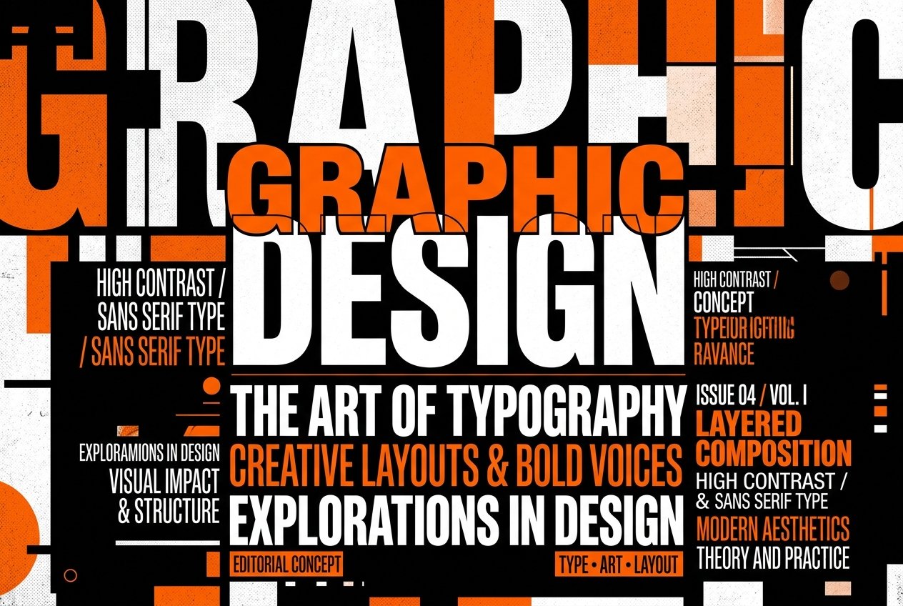
Serif fonts project heritage, trust, authority, and elegance, making them popular for luxury brands, editorial design, and traditional consulting. Sans-serif fonts represent modernity, innovation, simplicity, and friendliness, making them the go-to choice for tech startups, creative hubs, and digital agencies.
A font that looks stunning on a large high-resolution monitor might be unreadable on a mobile screen. Always test your text sizes, contrasts, and readability across desktop, tablet, and mobile platforms. Pixel Pulse designs typography with a mobile-first approach to guarantee accessibility.

All the Lorem Ipsum generators on the Internet tend in repetition predefined chunks an necessary, making this the combined with handful of model sentence structures,
Adam Jhon
February 10, 2024 at 2:37 pmMauris non dignissim purus, ac commodo diam. Donec sit amet lacinia nulla. Aliquam quis purus in justo pulvinar tempor. Aliquam tellus nulla, sollicitudin at euismod.
ReplyKristin Watsons
February 10, 2024 at 2:37 pmMauris non dignissim purus, ac commodo diam. Donec sit amet lacinia nulla. Aliquam quis purus in justo pulvinar tempor. Aliquam tellus nulla, sollicitudin at euismod.
ReplyKristin Watsons
February 10, 2024 at 2:37 pmMauris non dignissim purus, ac commodo diam. Donec sit amet lacinia nulla. Aliquam quis purus in justo pulvinar tempor. Aliquam tellus nulla, sollicitudin at euismod.
Reply